Optimizing the expenses
reporting process for freelancers
Mission
Product Design
Span
2 Weeks
Year
2023

02.
01.
03.
04.
05.
06.
CONTEXT
About the project
With The Design Crew, I had the opportunity to work on a case that dealt with a significant challenge for Netflix's business
My Role
I joined a team of 3 people aand I played a particularly active role in the ideation process and the presentation of testing results.
Problem
Solution
Discover
Define
Develop
Deliver
Design Process
For this case, our primary focus was on the Solution phase. As all three of us were users of Netflix, we leveraged our insights to ideate, develop an initial solution, test it with users, and iterate to create a final version that we presented.
INITIAL PROBLEM
👉 What ?
Users often spend excessive amounts of time searching for content on the platform, leading to frustration and eventually abandoning the application without watching anything.
👉 Why ?
- excessive information, making it challenging to make a decision.
- presence of imposed categories that may not align with users' specific preferences.
8 min
time on avg for a user to choose a content to watch
34%
of the opened sessions are left without finding anything to watch.
The Challenge
How to help Netflix users to find what they want to watch ?
IDEATION
By conducting benchmarks, creating mind maps and drafting some crazy 8, we came up with with 3 key ideas.
Our 3 ideas
1- Offering a curated and personalized selection of content
We choose to focus our delivery on this idea
2- Integrate a social network to give and receive recommandations
Too far away from netflix main business
3- Create a customized dashboard
Too redundant with the current homepage
User Journey
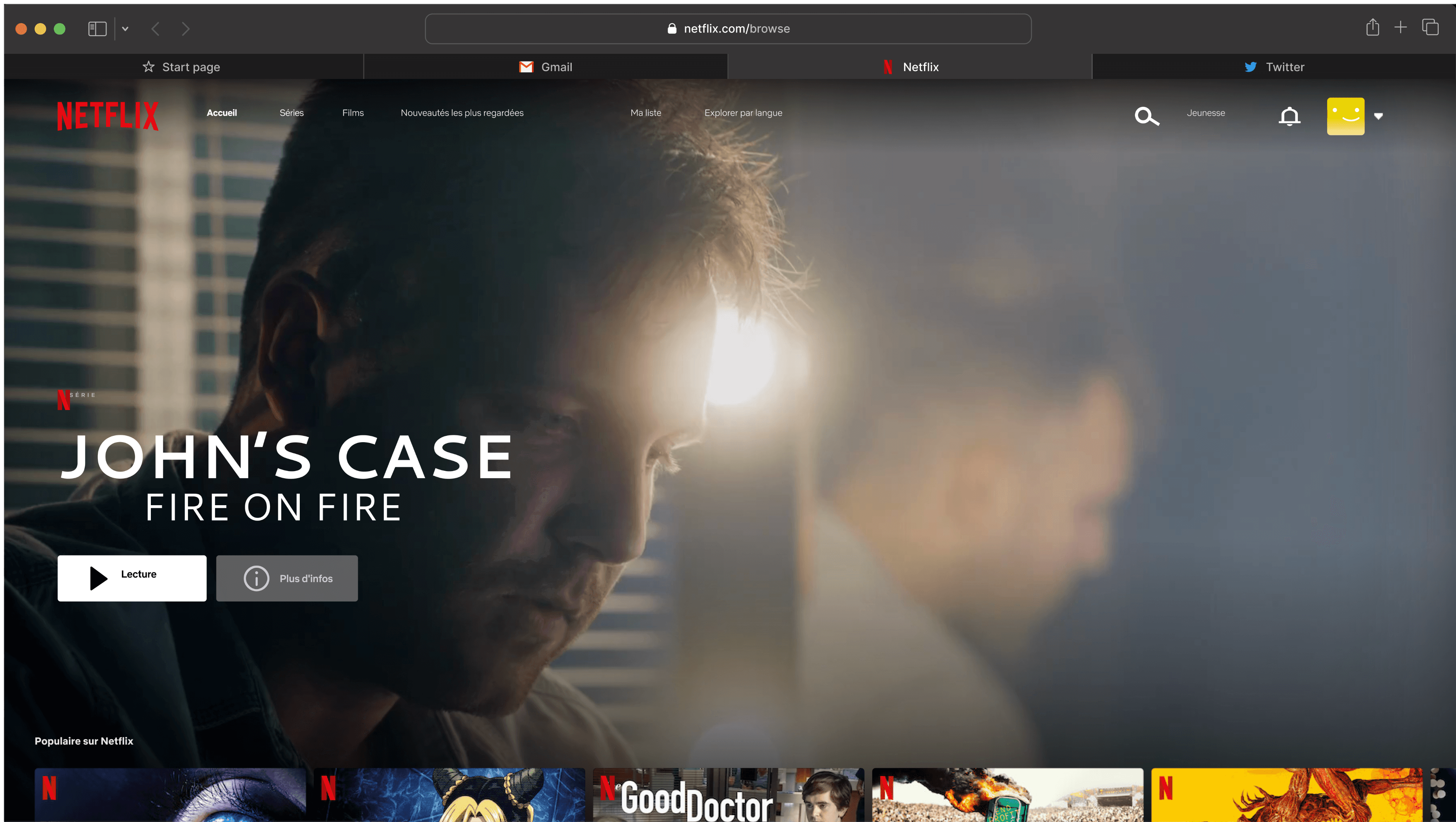
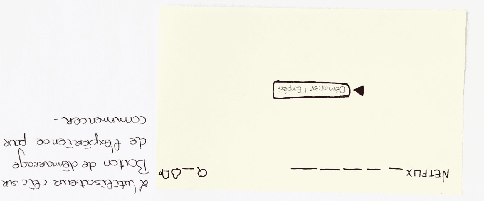
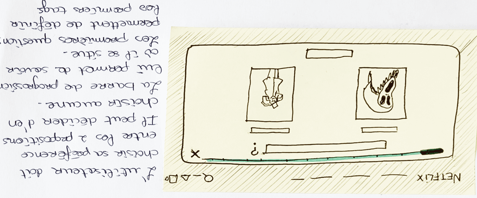
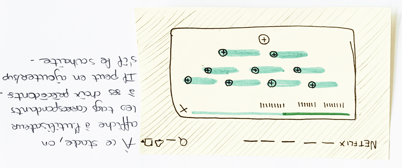
We defined the journey of a user who arrive on Netflix without any specifi idea of what content they want to watch.

1
2
3
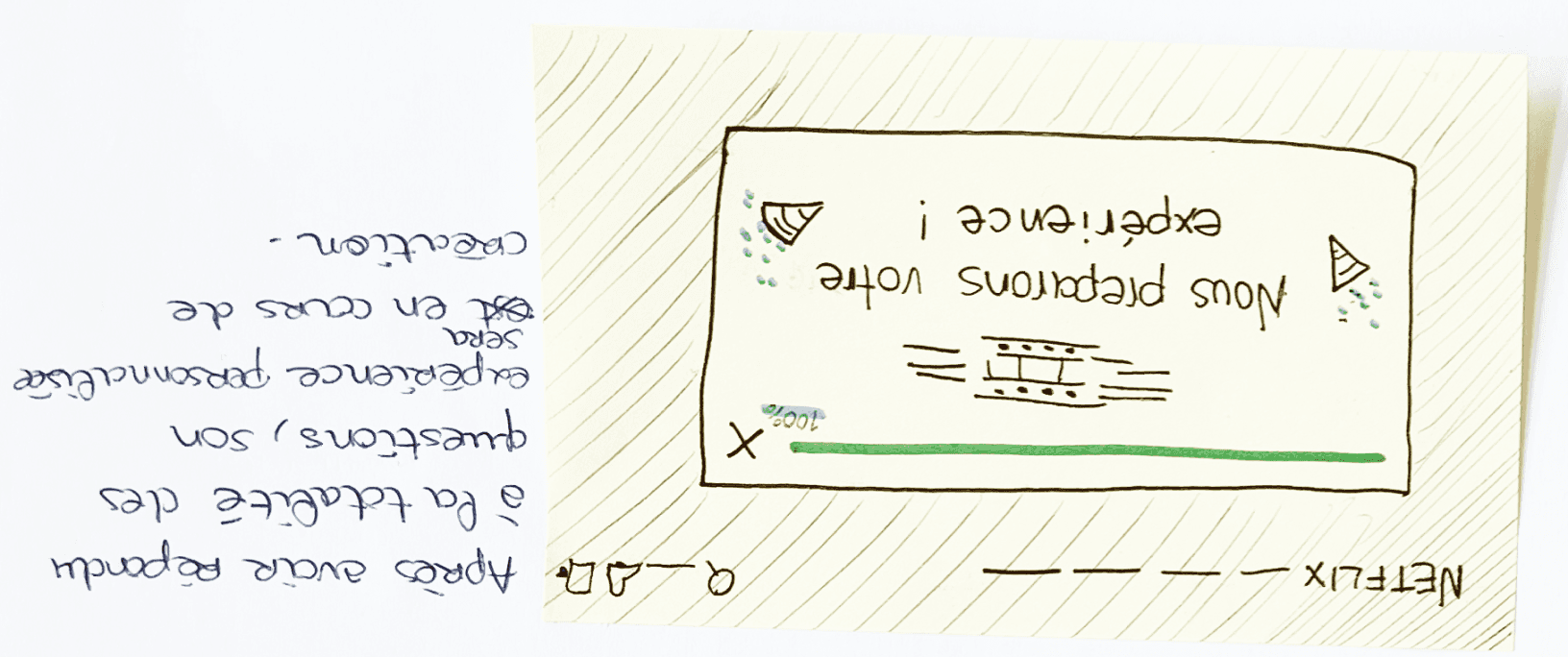
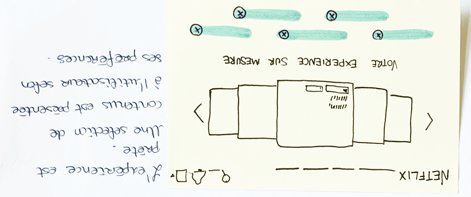
4
5
6
APPLY IDEAS IN A FIRST VERSION PROTOTYPE
#1 - Questionnaire
Introducing a fun and engaging 5-step questionnaire to assist users in exploring their preferences and finding content that aligns with their interests.
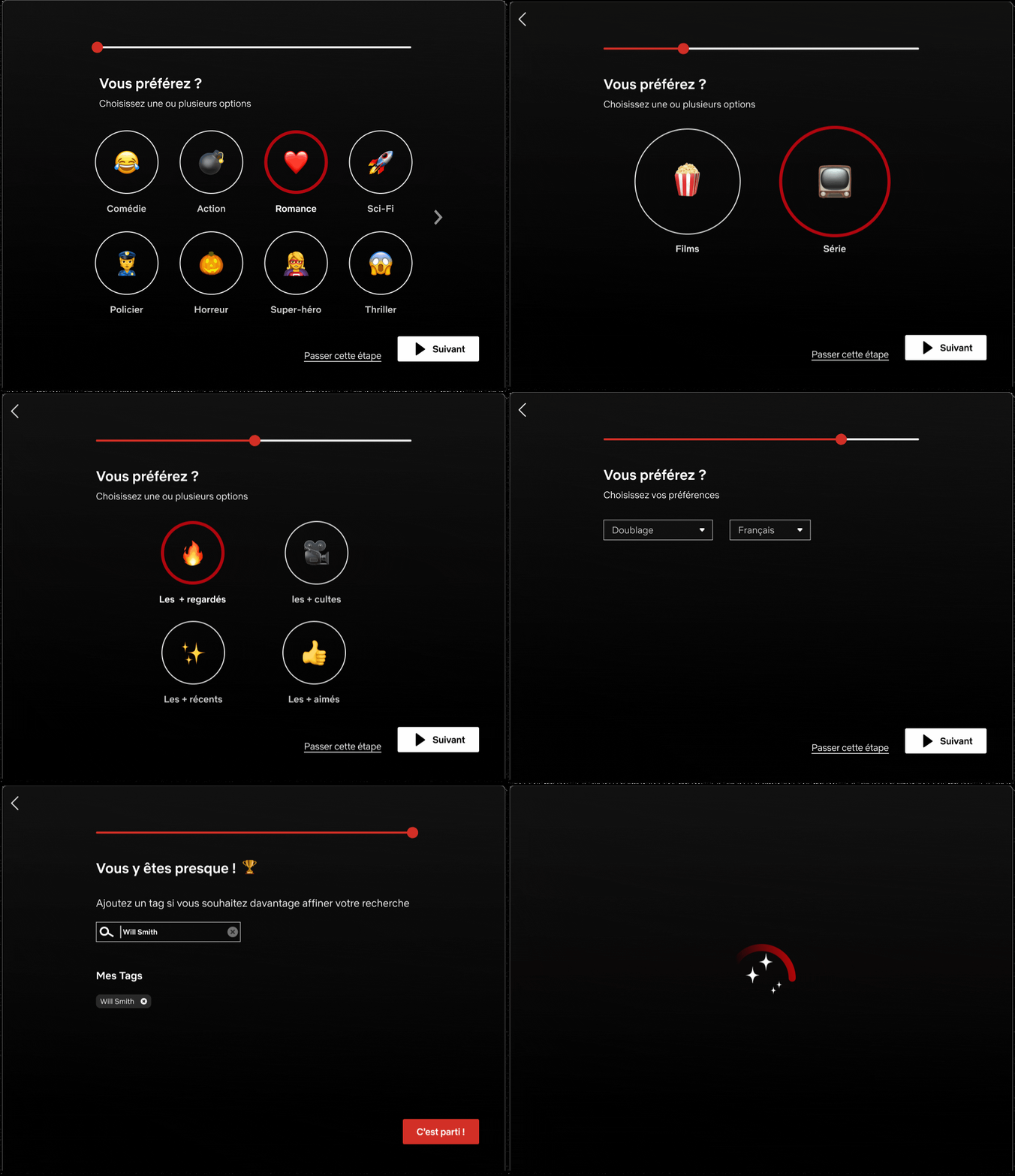
Short & Fast
Composed of 5 quick questions appearing in an overlay
Fun & playful
Emoji give the experience a fun way
Suspensful
The magic loading at the end evokes curiosity in the user, compelling him to explore what comes next.
Quick and custom !
#2 - My Mix
Based on the answers provided in the questionnaire, users can access to a personalized selection of only 5 content options tailored to their specific taste.

Remixer
Tous dans Ma liste
Mon mix
Une sélection pensée pour vous
Sci-Fi
Action
Films
Tendances
International
Will Smith
Genre

Préférences

Format

Langue originale

Mettre à Jour

Accueil
Séries
Films
Nouveautés les plus regardées
Ma liste
Mon mix
Explorer par langue
Jeunesse

Curated content
5 personalised content selected based on user's preferences and current interests.
Modify your mix
User can either modify their preferences (update) or view a new selection of 5 contents based on the same choices (remix).
Add to your list
User can add all the content at once in its list
TESTING OUR PROTOTYPE
User Tests
30 minutes each
Google meet sessions
Participants

Fanny 35 yo
Event Manager

Aïssatou, 20 yo
Student

Charlotte 36 yo
CEO

Balla, 34 yo
Consultant

Marie, 38 yo
HR manager
Key Insights
#1
Users don’t look or read items in the menu
Have noticed or clicked on “Mon mix” in the NavBar. When searching for a content, users don't naturally think to look in the menu as their first instinct.
Have noticed or clicked on "Mon mix" in the navigation bar. When searching for content, their initial instinct was to scroll down on the homepage.
0/5

Fanny
When I’m searching for a movie, I scroll down until I find something.. or not.
V1
V2

Our proposition
Access to the questionnaire after several scroll down in the homepage
#2
Users don’t know what to expect when clicking on “create my mix”
understand the concept of "my mix" and "create my mix," and the accompanying illustrations fail to provide clarity. Some users even perceive the feature as incomplete or unfinished due to this confusion.
0/5

Aïssatou
“Create my mix... it’s not obvious at all; I don’t know what to expect”.
V1
V2
Our proposition
No more dedicated page for the feature: direct access to the questionnaire
Review of the UX Writting: no more reference to “mix”
#3
There was confusion between “Update” and “Remix” buttons.
haven’t succeed to modify the the category selected; all of the users asked what was the difference between update and remix.
3/5

Charlotte
I found out how to do it, but it wasn’t obvious at all
V1
V2
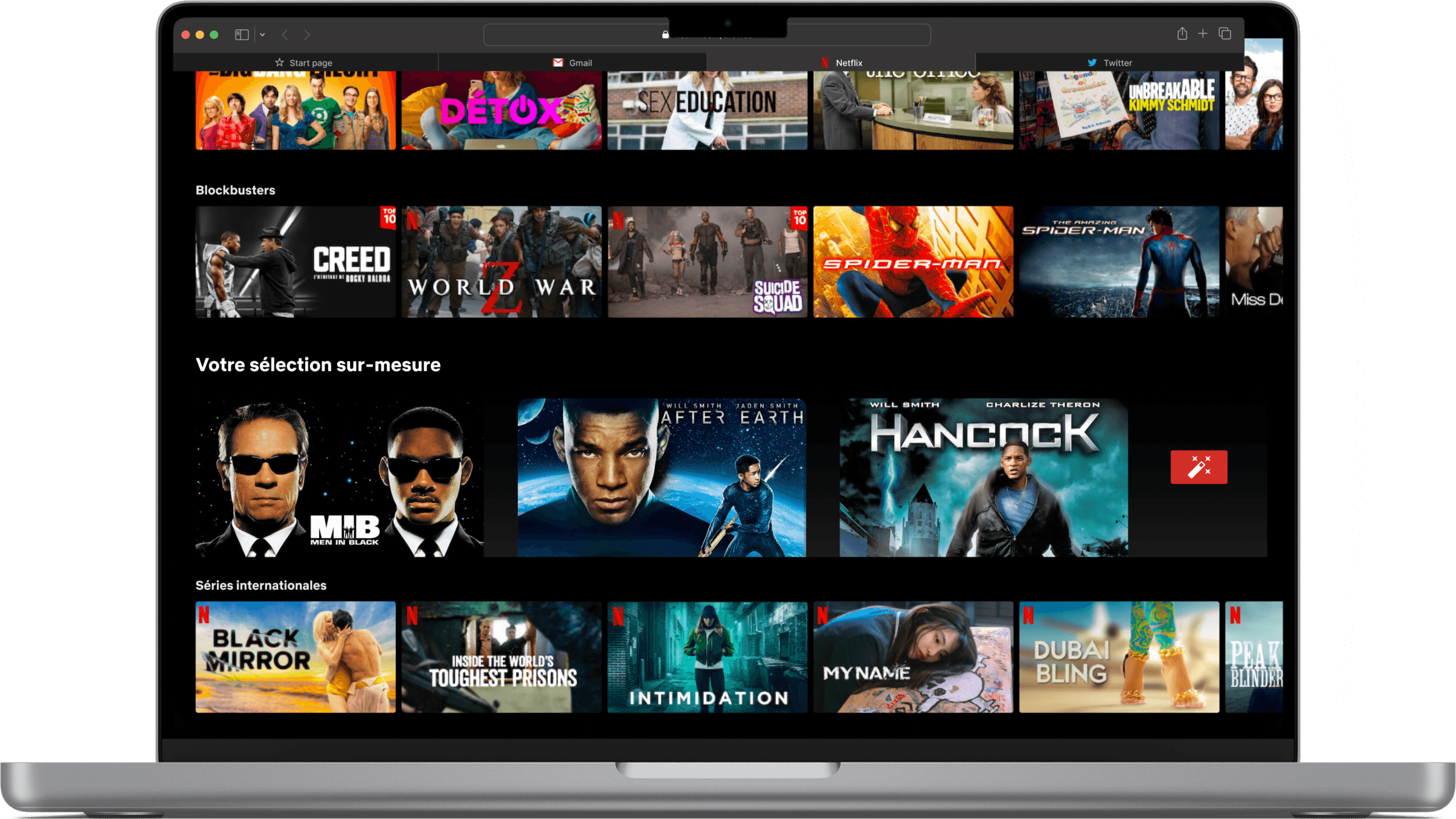
Our proposition
Removal of the dedicated screen for content selection
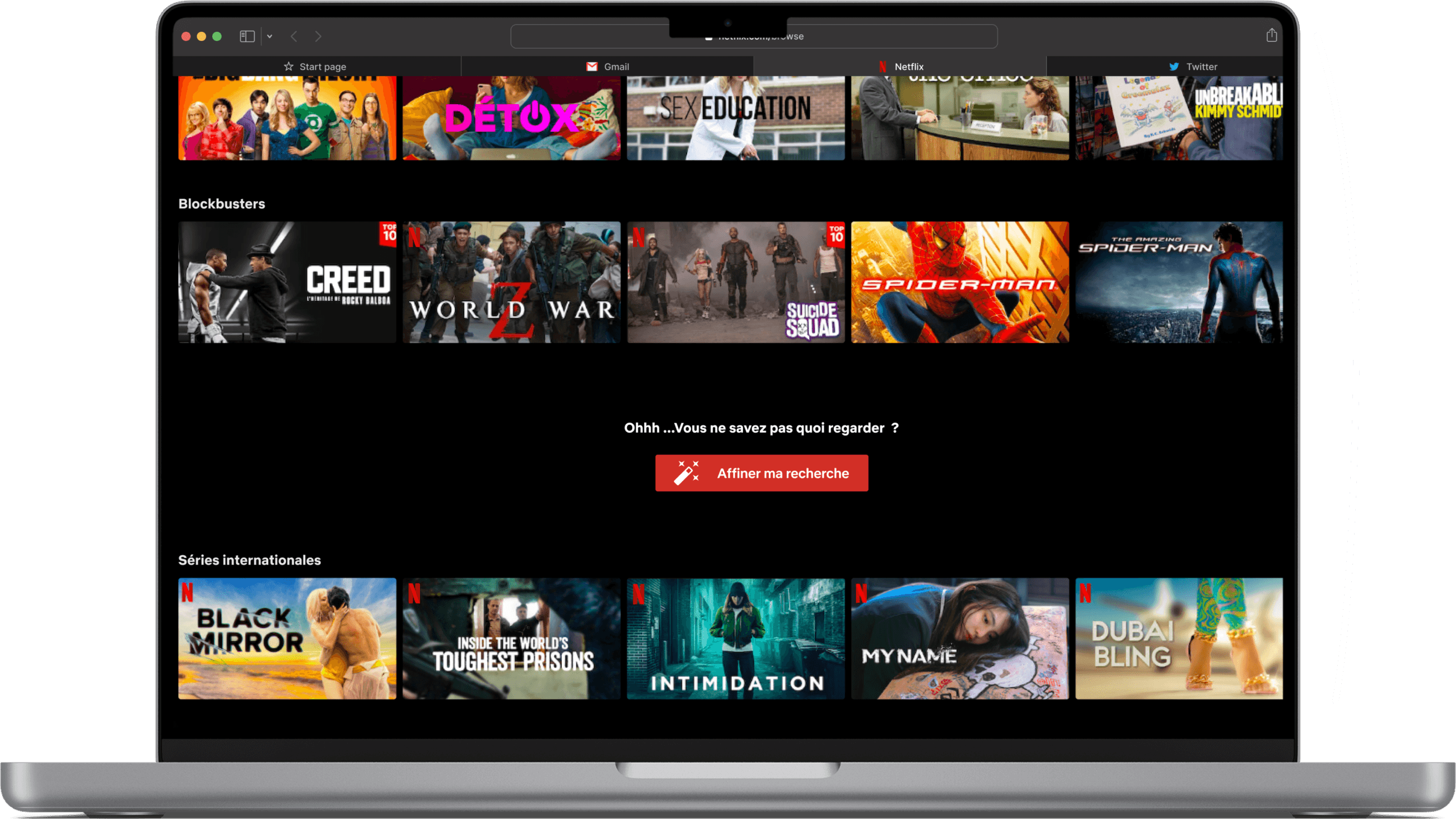
Selection of 3 personalised content directly on the homepage
Possibility to create new selection by clicking on the magic wand.
#4
Users enjoyed the idea of the quetionnaire
Found it funny, playful and were excited to see what was the proposal after the “magic loading”; they enjoyed a customized short selection also.
5/5

Balla
I like the questionnary with the emojis, I find it fun to do !
FINAL SOLUTION
By presenting a new feature that appears after the user has scrolled down several times during the “searching phase”, we provide a solution that is both unexpected and non-intrusive.
When the user clicks on the call-to-action (CTA), he will embark on a fresh and thrilling experience within the platform, ultimately receiving a tailored and concise selection of content.
This approach effectively addresses both issues: avoiding content overload and eliminating the imposition of categories.

Enjoy my work?
If you like what you see and want to work together, feel free to contact me !
Let’s chat !